Aspen Pumps Group
Engineering | B2B & B2C
360º branding and visual strategy project for a multinational engineering group
Background
My role
Creative director & lead designer. A hands-on, multi-disciplined role, reporting to the board of directors. I provided graphics team management and mentoring, branding project scoping, research and development, design of visual strategies encompassing print and digital, as well as physical environment design (exhibition stands & retail outfitting).
In the course of the overall project I was assisted by 2 senior and 2 junior graphic designers. All of the project imagery below was designed and executed by myself for the purpose of this presentation, except for the Aspen Pumps Group logo itself, which was designed by a former designer at the company.
Graphic language
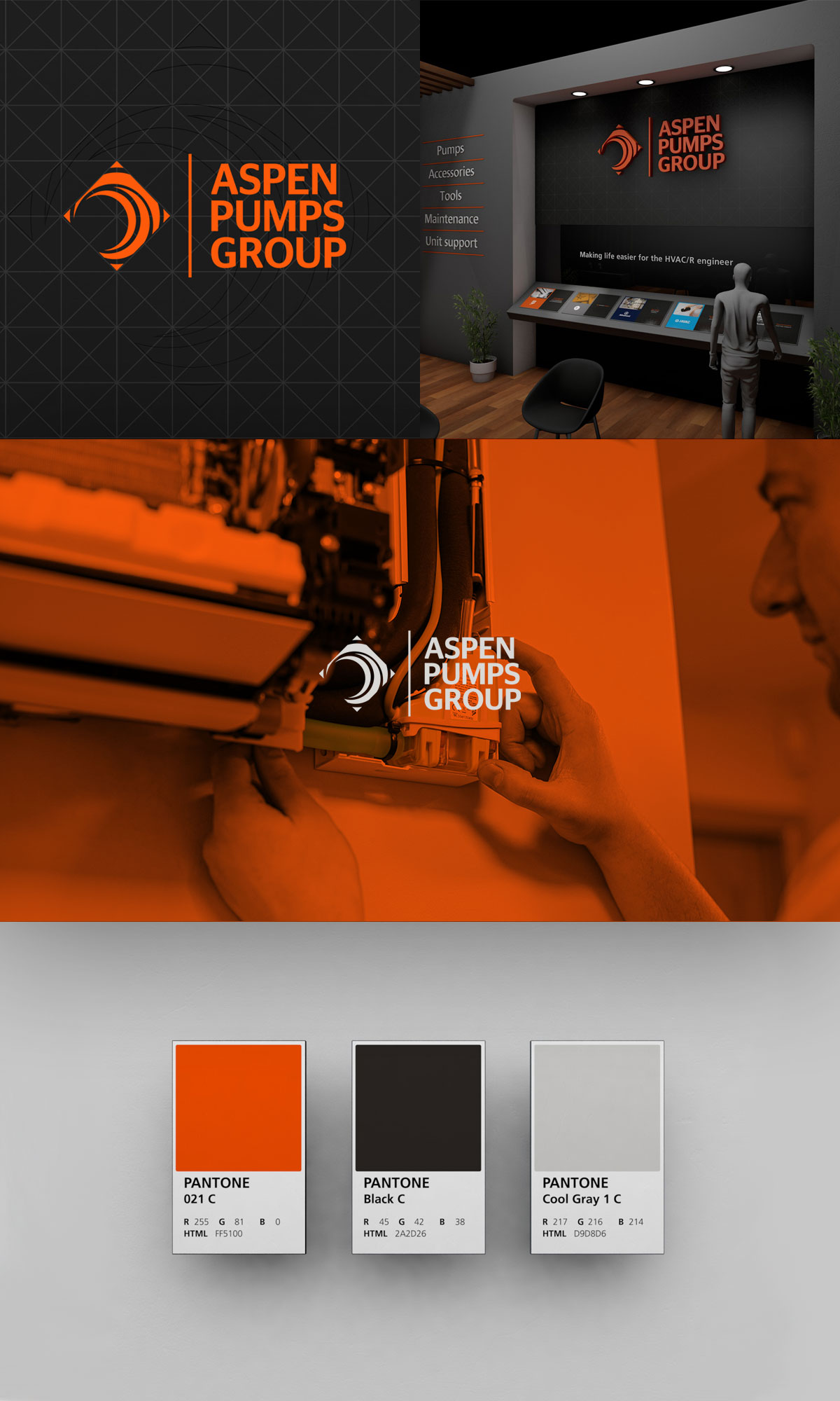
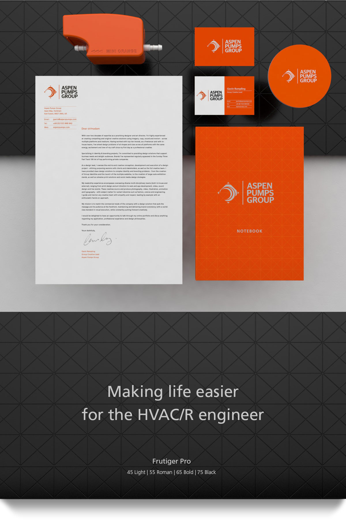
My first task was to develop a graphic language in keeping with the existing logo. I developed a grid form as a representation of permanence and reliability. Utilising both square and triangular forms within the grid helped frame the existing logo, as well as provide a visual theme throughout group marketing assets.
Packaging style
Arguably, product packaging provides the first main touch point between a brand and its audience. My task was to create a positive visceral experience for the end user of the group’s products – to create a visual design system that could be scalable across all the product brands.
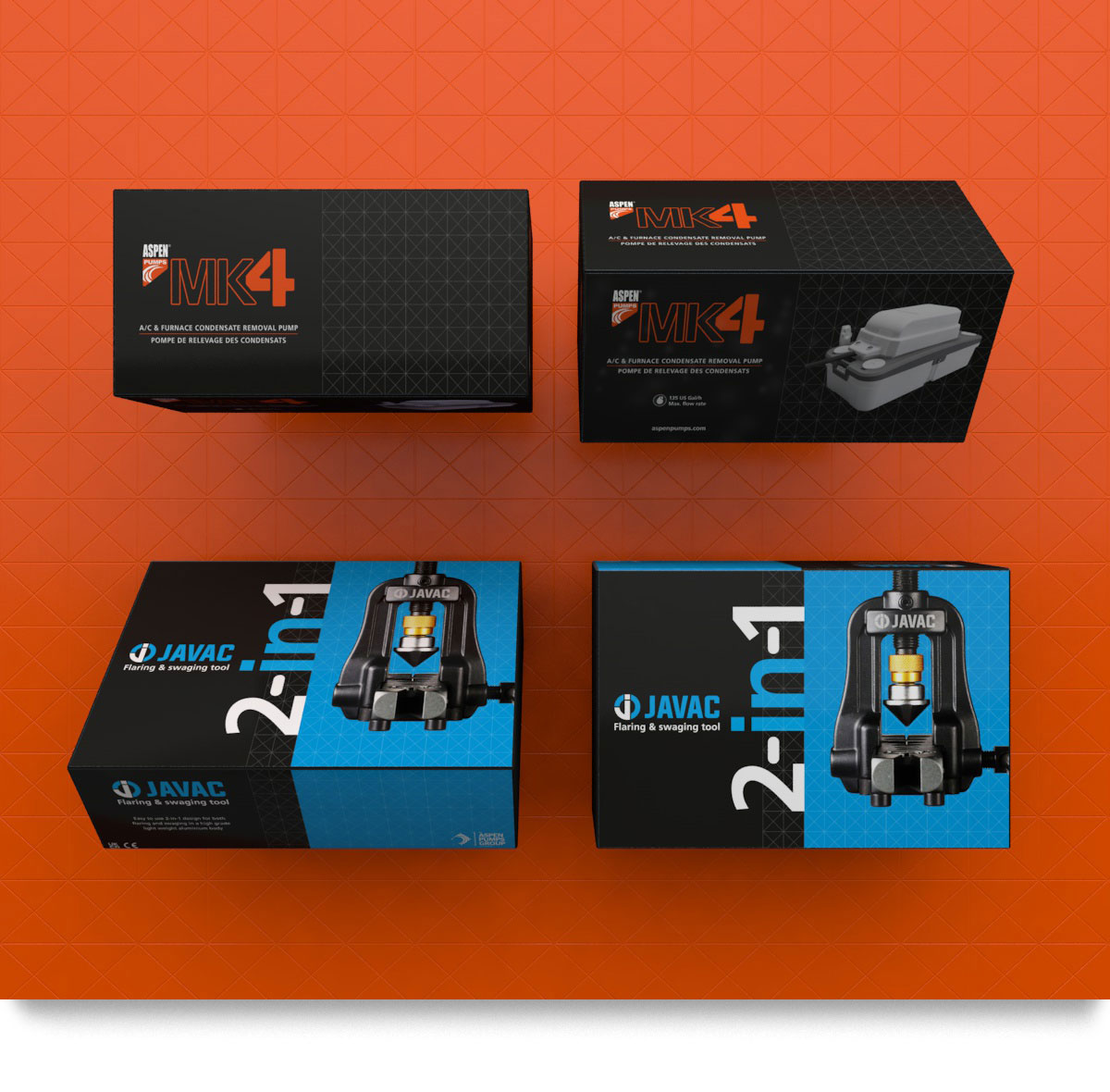
As well as designing and art directing the rest of the graphics team on the look and feel, I designed packaging with production costs, logistics issues and sustainability in mind. Production efficiency is the primary concern of the APG, so working closely with the procurement team was essential.
Costs for the product below had to be kept low, so a thin box board (F flute) was used. Thin boards, however, can be subjected to damage in transit – so I designed the size of the box to neatly fit together like bricks in either an outer carton (containing 6 boxes) or individually stacked on a pallet. By configuring the boxes to be stacked in a certain way, it helped minimise crushed boxes in transit.
Environment design style
I began to develop design systems for environmental spaces for various group events in 2018 – including large scale global exhibitions. What began as developing visuals to aid the directors make decisions on exhibition involvement turned into shifting the designing of the exhibition spaces to my own team, saving costs on 3rd party designers and giving creative control to the in-house design team.
Photography style
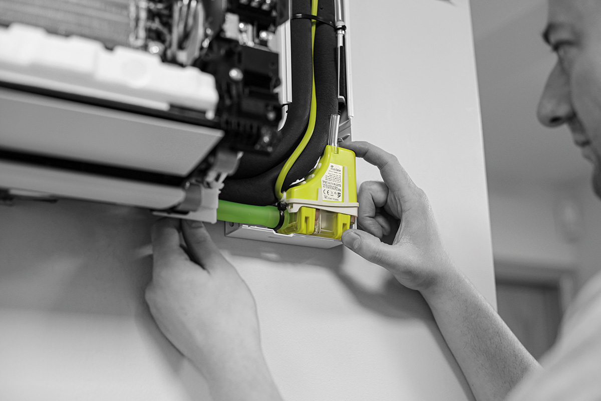
After product packaging, product photography forms one of the main visual forms for the brands. The group promise is to make life easier for the engineer, so it made sense to always shoot product in the hands of the engineer, just at the point of their installations.
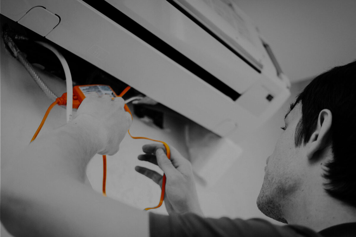
One of the key marketing values for the pumps business is the use of colour. For the pumps business, photographs are converted to greyscale whilst leaving product in their own brand colours.
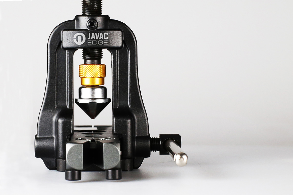
Tools are shot in close detail, highlighting the level of quality apparent in their manufacture.
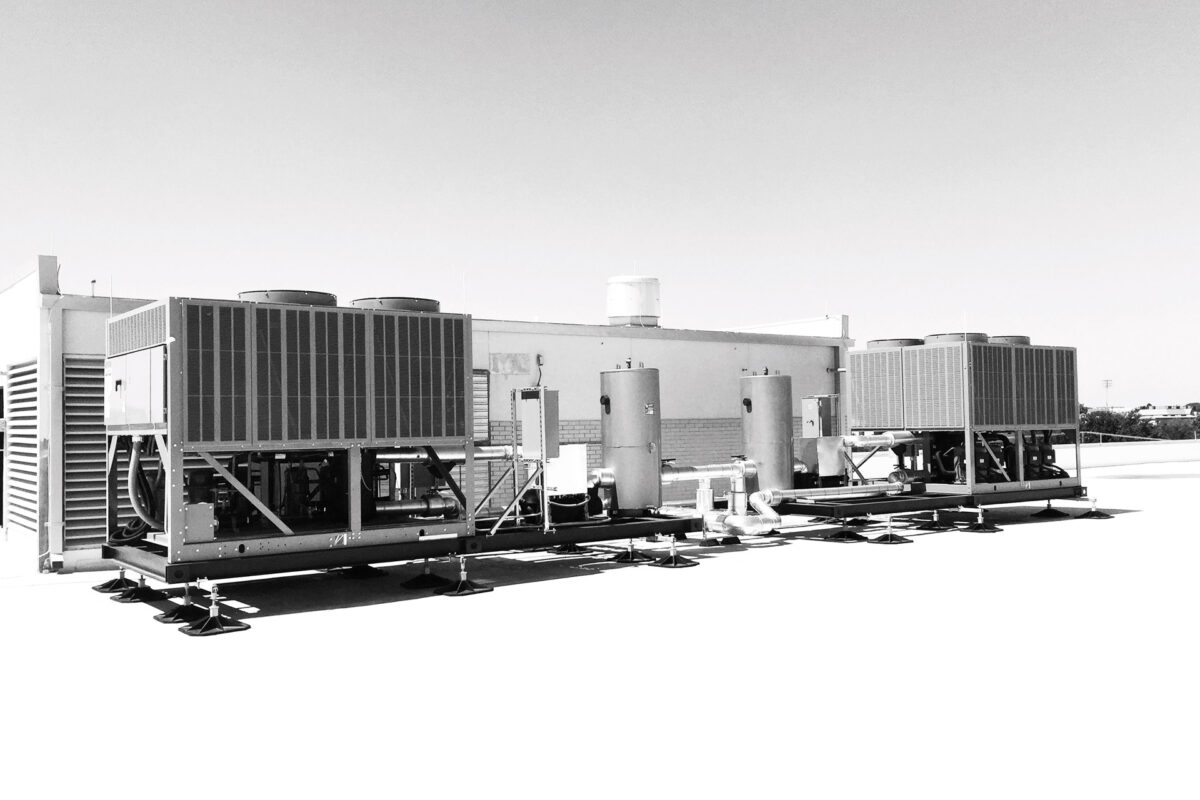
As they are project based, unit support systems are shot on location. All photography is converted to black and white – largely because site photography is conducted by a range of site engineers as apposed to professional photographers. Converting to black and white reduces the inconsistencies of coloured photography.
Digital
Covering social channels (Youtube, Instagram, Facebook & LinkedIn), as well as Powerpoint presentations for both internal and external partners.
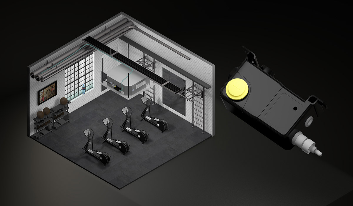
I introduced motion graphics and product/service explainer films to the APG in 2015. Utilising my 3D visualisation knowledge, I created an in-house animation style for product & service explainers to help convey USPs. Isometric ‘mini worlds’ became the preferred method for delivering the animation style – it was an instant yes from the board and a big hit with suppliers who asked to use the assets on their own websites.

