Big Foot Systems
Construction + Engineering | B2B
Development of the Big Foot Systems premium brand position.
Background
My role
It was my task to define a new visual strategy and premium tone of voice. I directed one other graphic designer and together we produced a number of deliverables to showcase the new brand direction. The new design system incorporated photography, illustration, motion design, print & social patterns.
Graphic language
The scoping project began with an audit of the existing graphic language assets: Brochures, photography, illustration, data sheets, adverts & social media. Having pulled all these elements together I began to map out the competitor landscape and devise a look and feel that would elevate the BFS brand to the premium status the board knew they occupied.
Photography
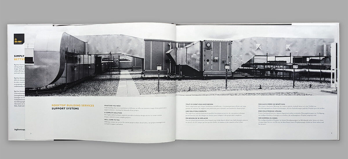
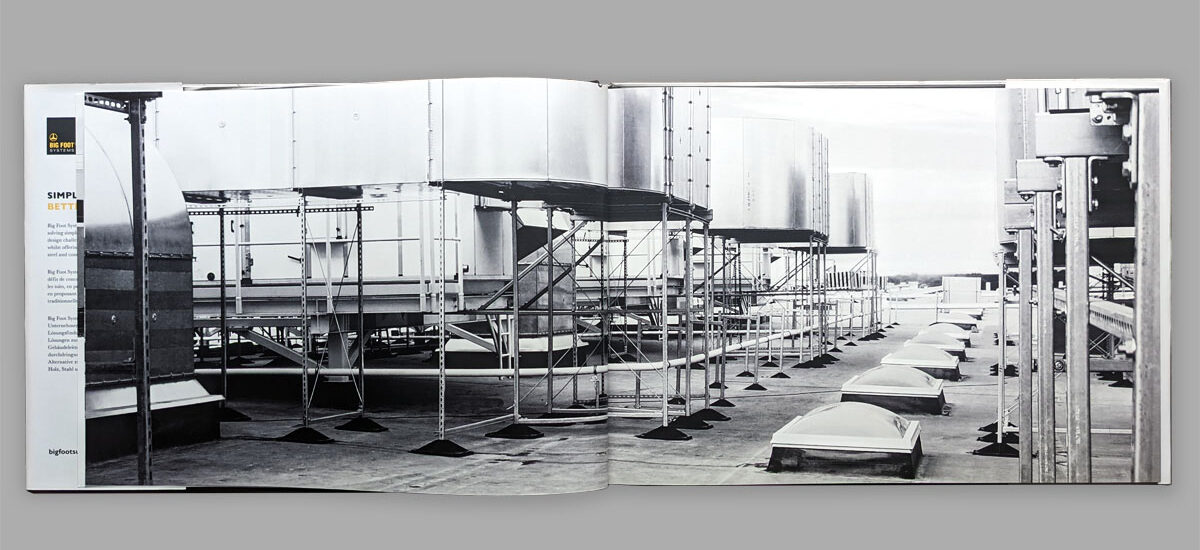
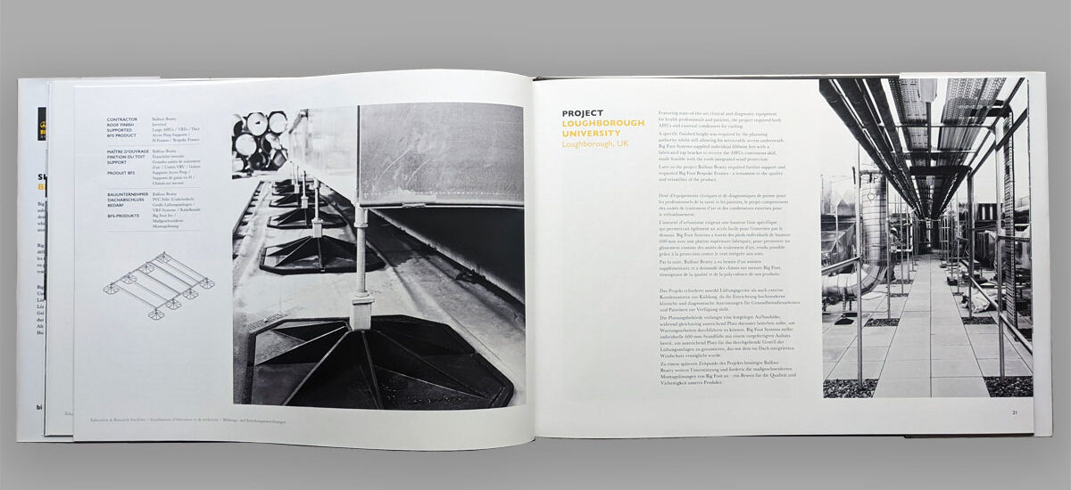
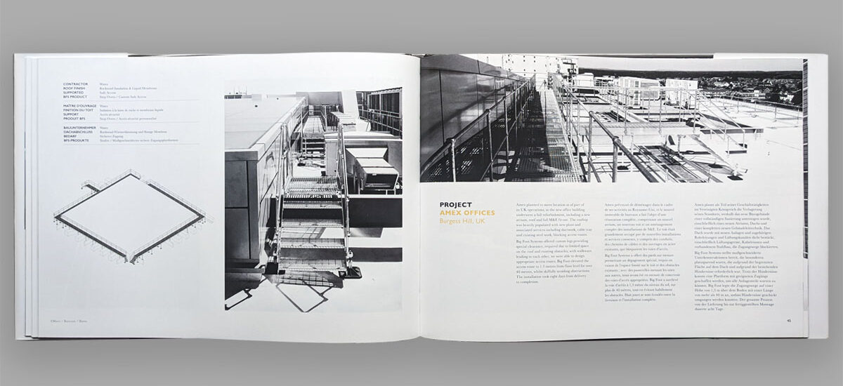
All photographic assets were converted to grayscale, given a contrast boost and slight grain effect. This gave a more consistent photographic style across all project spreads, as well as adding a sense of quality that the original images lacked.

Illustration
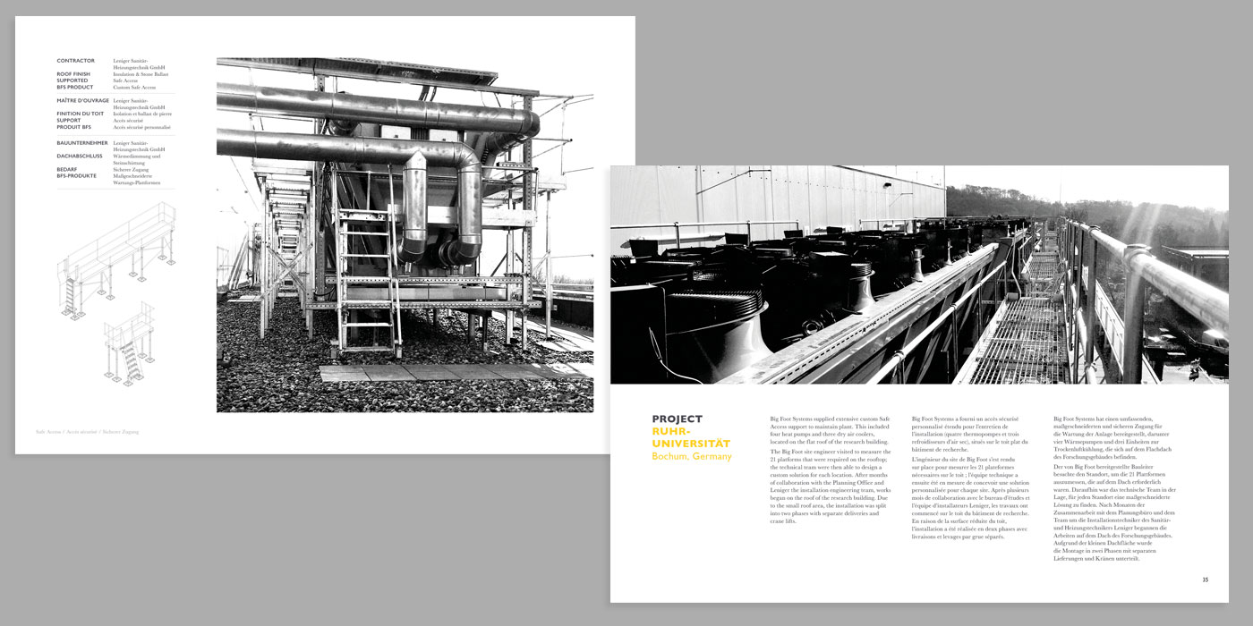
Supporting graphics were found in the project technical drawing archives. These drawings convey the extent of the project designs using simple isometric views. Taken off the drawing sheets and cleaned up, they help the reader understand the complete project in one easy visual.
Motion design
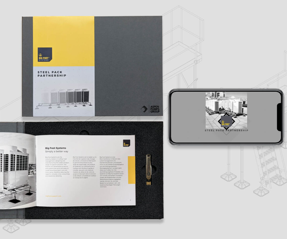
To help explain both the off the shelf product and the large scale project team service, I created a set of house style animations using both 2D & 3D workflows.

Print design
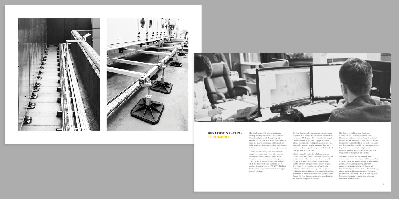
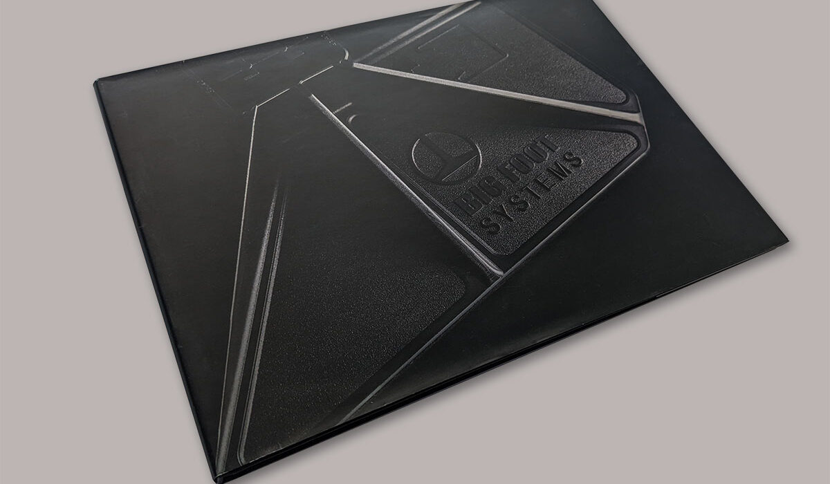
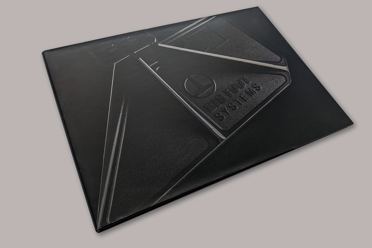
One of the principal outputs from the project was the creation of a coffee table style case study book. The hardback book was issued to premium customers, as well as sent to leading architects firms and construction contractors.
A 3×4 grid was used throughout to offer plenty of variation in page layouts, and to showcase the breadth of project photography.
A sans serif (headlines) was paired with a classic serif (body copy) typeface to enhance the classic architects book feel.
